Badge
The Radzen Blazor Badge component is a small graphic that displays important information, like a count or label, within a user interface. It's commonly used to draw attention to something or provide visual feedback to the user.
Badge Style link
To set a predefined badge style, use the BadgeStyle property, e.g. BadgeStyle="BadgeStyle.Primary".
Badge Shade link
Each badge style, except Light and Dark, comes with a set of shades. Use the Shade property, e.g. Shade="Shade.Lighter".
Badge Variant link
Each badge style and shade can be used with different badge variants. Use the Variant property, e.g. Variant="Variant.Outlined".
Pill link
Use IsPill="true" for pill-shaped badges.
Child Content link
Define custom content with ease.
Supercharge your Blazor development with Radzen
Whether you prefer a standalone environment or integration directly within Visual Studio, Radzen provides a powerful toolkit to increase development speed, reduce repetitive coding, and focus on building exceptional applications.
Radzen Blazor Studio
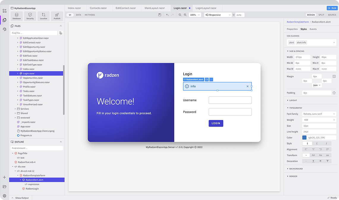
Radzen Blazor Studio is a software development environment that empowers developers to design, build and deploy Blazor applications without the traditional hurdles.
Radzen Blazor for Visual Studio
Radzen Blazor for Visual Studio extension streamlines Blazor development within the Visual Studio environment. The Blazor extension you need to boost productivity!

Radzen Blazor Components, © 2018-2025 Radzen.
Source Code licensed under
MIT